Tuesday, July 25, 2006
Are you a kindred spirit?

Growing up I loved the Anne of Green Gables series. Timeless classics. I recently started reading them again. Wow, I wait on pins and needles to see what Anne Shirley is up to next. And oh, Gilbert Blythe. My heart flutters. Lucy Maud Montgomery wrote these books at the turn of the 20th century, so I guess the copywrite is expired so you can find electronic versions all over the internet.
My sister, Cat, is seven years younger than me. It was trying at times sharing a room with her as we were growing up. But not everything was filled with arguments and despair. We both loved these books. We would stay awake for hours when we should have been in bed. Me, reading about Anne's adventures, while she brushed my hair. That's probably one of my favorite memories about growing up. Now, my sister is perfectly delightful and I can honestly say she is a true "kindred spirit".
Sunday, July 23, 2006
cool
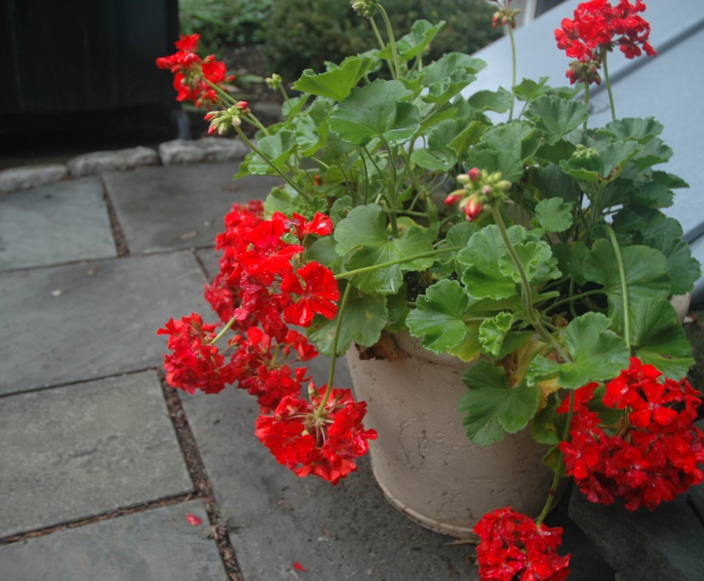
My mother dislikes geraniums. I think she may have tainted them for me. I've never thought of planting some until this year. Last summer I noticed some on my drive home from work and realized how nice it is that they are always in bloom. I thought I'd give them a shot. I put a few in this container by my back door and they have thrived. There's always tons of blooms on it, and just seeing it when I come into the house makes me happy.
In this photo it had just rained, so the blooms are a little weighed down. I love how they droop over the pot like that. It just seems so graceful to me.
Thursday, July 20, 2006
Look what I can do!
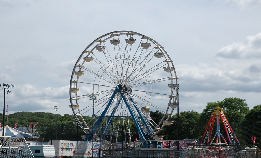
So, my sister tells me the other day that she reads my blog. Um. There's not much to read. I know a few other people that might be checking in here from time to time, so it's making me feel real guilty that I don't post more often. Honestly, I'm pretty boring so reading this can not possibly be 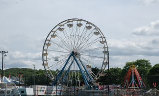 that much fun. But moving on...I learned a new photoshop trick:
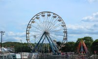
So, which one looks better? Simple color replacement and the photo really pops. Makes it look more cheerful. This is a shot of the 4th of July fair that is here in Lexington every year. We didn't make it there this year, but this was last year. Actually funny story there. Brian was testing out some motion sickness medicine. He usually can't handle the rides, but the meds seemed to be working for him. We got on this one ride that had us lying on our stomachs and going around and around. Picture me as superman who can only fly in a circle. It was terribly uncomfortable. Well it all got to me, and right after we got off I threw up. What a wuss. Guess I'm getting too old.
 that much fun. But moving on...I learned a new photoshop trick:
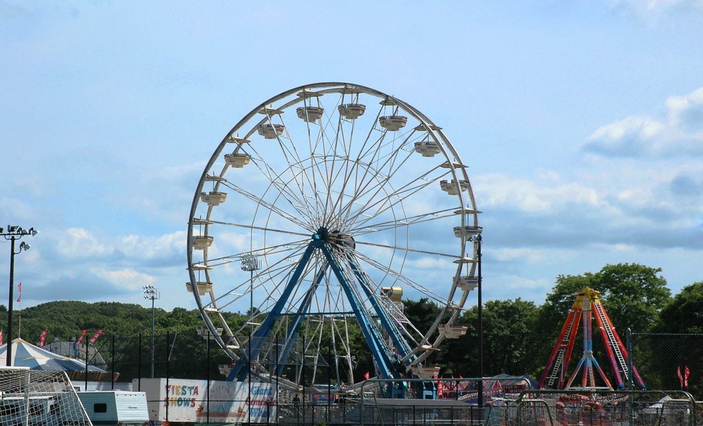
So, which one looks better? Simple color replacement and the photo really pops. Makes it look more cheerful. This is a shot of the 4th of July fair that is here in Lexington every year. We didn't make it there this year, but this was last year. Actually funny story there. Brian was testing out some motion sickness medicine. He usually can't handle the rides, but the meds seemed to be working for him. We got on this one ride that had us lying on our stomachs and going around and around. Picture me as superman who can only fly in a circle. It was terribly uncomfortable. Well it all got to me, and right after we got off I threw up. What a wuss. Guess I'm getting too old.
Tuesday, July 18, 2006
I believe I can fly...

Okay, this post is for you, Cat...for the most awesome flight search engine go to kayak where they do all the work for you. They search all the sites (cheaptickets, travelocity, continental, delta, etc) and find the cheapest flight for you. It's really great and easy to use. Love it.
Monday, July 10, 2006
Fun.
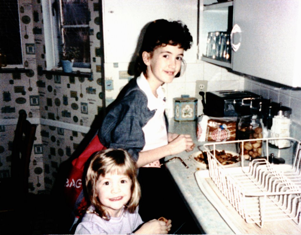
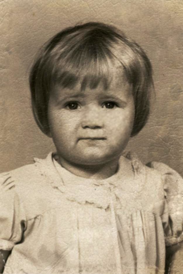 Old photos are so much fun. They are so interesting to look at and compare to how things are now. Brian's father and aunt are having a big joint 60th birthday party this weekend. I'm in charge of putting a slideshow together of photos. I get engrossed in these old photos. Love how they look. Old. Faded. They have this old sepia tone tint. This cute little girl is Brian's Aunt Stephanie. It's kind of funny how you can kind of see a bit of her in now in her baby photo.
Cherish your photos, and don't forget to take LOTS!
Friday, July 07, 2006
Typographic Art
Well, it has been quite some time since I posted on this blog. I wish I was more disciplined about it. How can I change that. I guess my problem is that I rarely have anything exiting on my mind. But here's what is on my mind today.
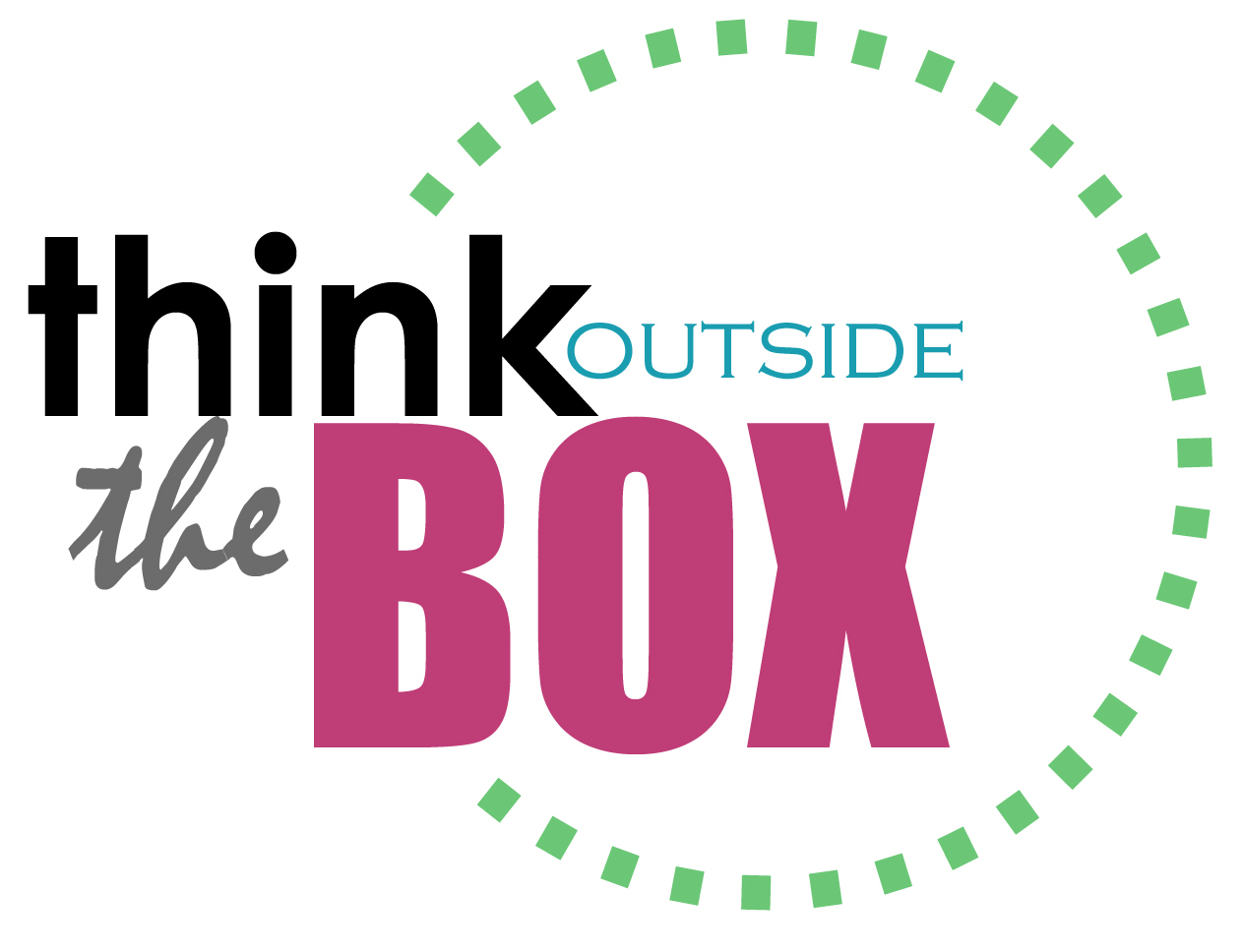
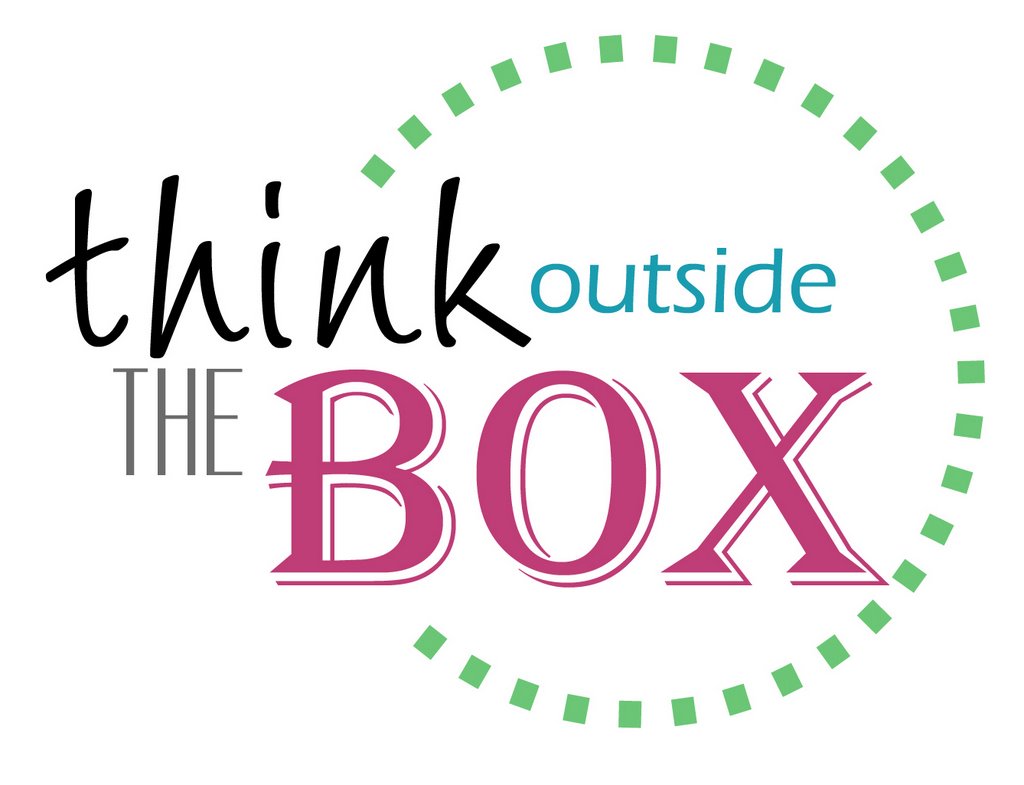
Typography.
I've always been into typography - the art and technique of combining fonts. Serif, san-serif, alignment, spacing, size, color. It's all so cruital to the outcome.
I whipped up two quick examples of how much of a difference fonts can make. How boring would this text look without the different fonts? The different sizes? The different colors?
Obviously everyone's idea of appealing is different, but it feels like a work of art to make these changes to some simple text. I love scouring the internet for examples of typography. They pop up in all kinds of strange places. Ads. Logos. Product labels.
Another thing that I've had issues with lately is the whole, one space after a period thingy. I like it. Text looks better. Executing it, on the other hand, is not as easy. I have these automatic motor skills that are so ingrained in me that I can't break the habit of putting two spaces after a period. Why is that? I'm trying to break the habit, but it has been a real effort.
![]()